


Table of Contents
Explore our comprehensive guide to Yoroflow‘s reporting capabilities, where raw data is transformed into actionable insights. Discover how to create customized, detailed reports that propel your projects towards success.
This post walks you through Yoroflow‘s reporting features and demonstrates how you can quickly and easily start using the platform.
Benefits of Using Yoroflow Reports
Discover the advantages of using Yoroflow for generating reports with these key reasons.
Visual Data Representation
Yoroflow offers a range of visual data representations to help you understand and analyze your data effectively. Some of the visualizations available in Yoroflow include Gantt Charts, Kanban Boards, Calendars, Pie Charts, Line Charts, and Bar Charts. These visualizations help you gain insights, track progress, and make data-driven decisions efficiently.
Tracking Progress
Easily see which tasks are finished and currently being worked on, view the time spent on each task, and identify who is behind schedule. Reports allow you to track the time spent on individual tasks and the progress of each project.
Time Efficiency
Yoroflow reports allow you to gather all necessary information in one place, measure the time taken by various tasks, identify areas for improvement, and drive-up work efficiency. You can even automate recurring tasks to save more time within the tool.
Customization Options
Yoroflow offers many ways to create reports that align perfectly with your needs. The templates are customizable for all types of tasks or projects, and you can brand the templates to make your reports easily identifiable by clients.
Data Transparency
Yoroflow creates precise reports using the data you provide, helping reveal your employees’ actions clearly and honestly. You can personalize and share these reports with customers and stakeholders to enhance responsibility and transparency, leading to a deeper understanding of your project’s progress.
Types of Yoroflow Reports
Yoroflow offers a variety of reports suitable for every industry and business. Choose the Yoroflow report that works for you and capture actionable insights to boost management, planning, and performance.
Dashboards
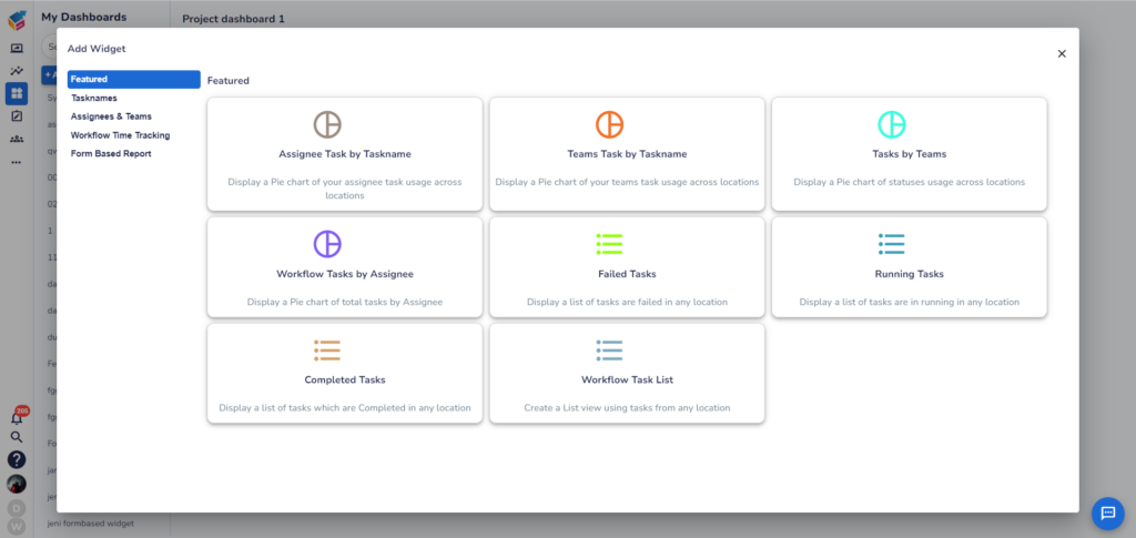
Yoroflow dashboards consolidate data sources, enabling instant access to real-time information, comprehension of key metrics, identification of workflow bottlenecks, and more. Customize your dashboard by adding, rearranging, and resizing widgets to suit your needs. Yoroflow offers a wide range of widget options, including task checklists, time-tracking summaries, progress charts, burndown charts, and more.
The visual displays in Yoroflow help you identify patterns and bottlenecks, track progress, and make data-driven decisions. Yoroflow can generate multiple dashboards for different projects, teams, or areas of interest, each tailored to display relevant information.
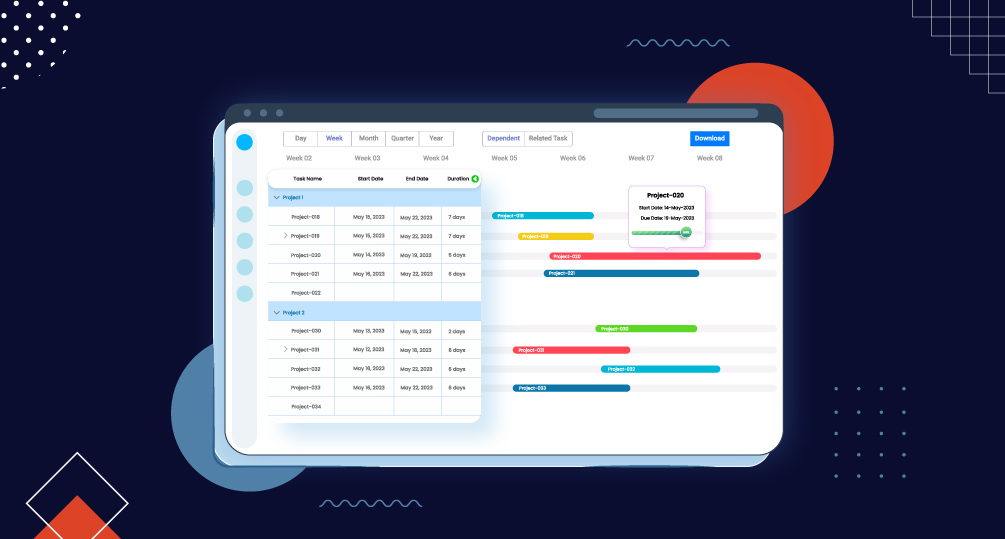
Gantt Charts
Gantt charts are powerful visual tools for displaying project timelines and task dependencies. In Yoroflow, Gantt charts provide an overview of tasks as horizontal bars with start and due dates. They allow task management through drag-and-drop functionality, date adjustments, dependency modifications, and progress updates. Collaboration is seamless as you can assign tasks, add comments, attach files, and communicate within the context of each task directly on the Gantt chart.
Time Tracking
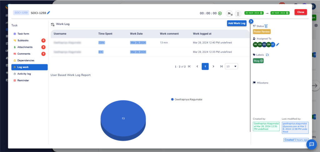
Time tracking provides real-time feedback on project status, enabling you to monitor progress, identify bottlenecks, and optimize resource allocation. Yoroflow‘s time tracking feature allows you to create reports that analyze time spent on tasks, projects, or by individual team members.
Workload Reports
Yoroflow‘s workload reports visualize each team member’s assigned work during the selected period, such as one or two weeks or one month. These reports compare each person’s workload with the capacity set for them.
How to Utilize Yoroflow Reports
Learn how to harness the power of Yoroflow reports to enhance team performance and make informed task management decisions.
Generating Reports
Create and customize reports in Yoroflow based on specific criteria. Identify key performance indicators (KPIs) and add relevant data to the tool. Avoid including unnecessary data and ensure metric consistency.
Data Analysis
Select a report template based on the data you want to analyze. Specify the data, set filters, and choose relevant metrics. Define the date range, report format, and scheduling options if you want to generate the report regularly. Analyze the generated report using charts, graphs, tables, and other visualizations. Drill down into specific data points for deeper insights.
Sharing Reports
Easily share reports with others for visibility and collaboration. Generate the report, go to the “Reports” tab in Yoroflow, locate the report. Select the “Download” option to save the report as a PDF file. Share the downloaded file with external stakeholders via email or other methods. For internal sharing, link the report in a task or comment, attach the report file, or use Yoroflow‘s integrations and communication tools.
Customizing Views
Tailor your workspace and task layouts to meet your specific needs. Yoroflow offers various views, such as List and Board. Customize columns in List view to display relevant task attributes. Create and label columns in Board view to represent different task statuses or project phases. Customize the layout and structure of tasks in Board view.
Yoroflow ranks among the leading no-code software options. Its reporting functionality is both efficient and effective, saving you time and providing valuable insights. Yoroflow offers a wide range of customization options for your reports. While the platform comes with numerous features, understanding and utilizing them all can be time-consuming.